
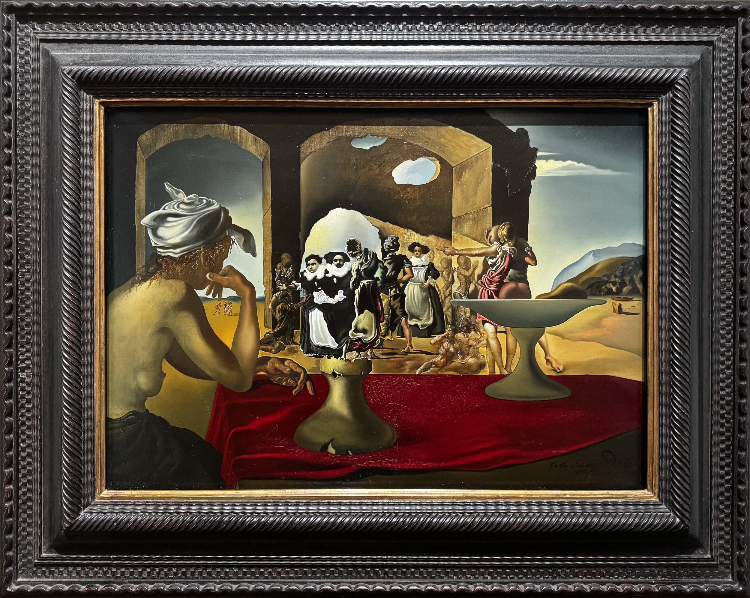
Slave Market with the Disappearing Bust of Voltaire (1940)
Salvador Dalí (1904-1989)
Slave Market with the Disappearing Bust of Voltaire, 1940
Oil on canvas
18 1/4 in x 25 3/4 in
The Dalí Museum, St. Petersburg, FL
You could spend an entire evening debating which Salvador Dalí visual is more iconic: his moustache or the melting clocks. What’s indisputable, however, is the impact of his surrealist paintings. And while I don’t like to oversimplify art, it’s generally accepted that one of the main reasons his works continue to amuse and fascinate is because he consistently explored concepts of duality through the use of imagery that refused to be easily defined. Regardless of theme, a recurring technique he employed was the ‘double-image’: e.g. something that could be seen as two different things. Not interpreted. Seen.
The most common way Dalí achieved this was by blending or morphing. His 1937 painting Metamorphosis of Narcissus contains large rock formations that appear to be a crouching figure or hand holding an egg. Another way he achieved duality was by carefully arranging items so that two distinct representations are possible depending on your distance and vantage point from the canvas. In other words, an optical illusion. One famous and very humorous example is the 1935 work in which he arranged common apartment furnishings such that they appear to be the Face of Mae West.
These are just two of many, many Dalí works in which you can ‘see’ multiple things. The man was incredibly skilled at the trick, but very few of his works reached the pinnacle of illusion that could trigger a duck or rabbit level of debate and confusion. Until 1940.
There’s a lot going on in ‘Slave Market with the Disappearing Bust of Voltaire’, a painting with a composition as elaborate as its title, so let’s quickly break it down. It depicts a slave market, with a half-naked woman (assumed to be his wife, Gala) in the foreground watching the main event, while in the far distance on either side of the canvas you can spot tiny figures. Dalí was always including tiny figures doing things in the distance in his landscapes and to say there is a lot to analyse in this painting would be an understatement. I find it more engaging to treat it like a click-bait challenge and ask: How many figures do you see in the entire image?
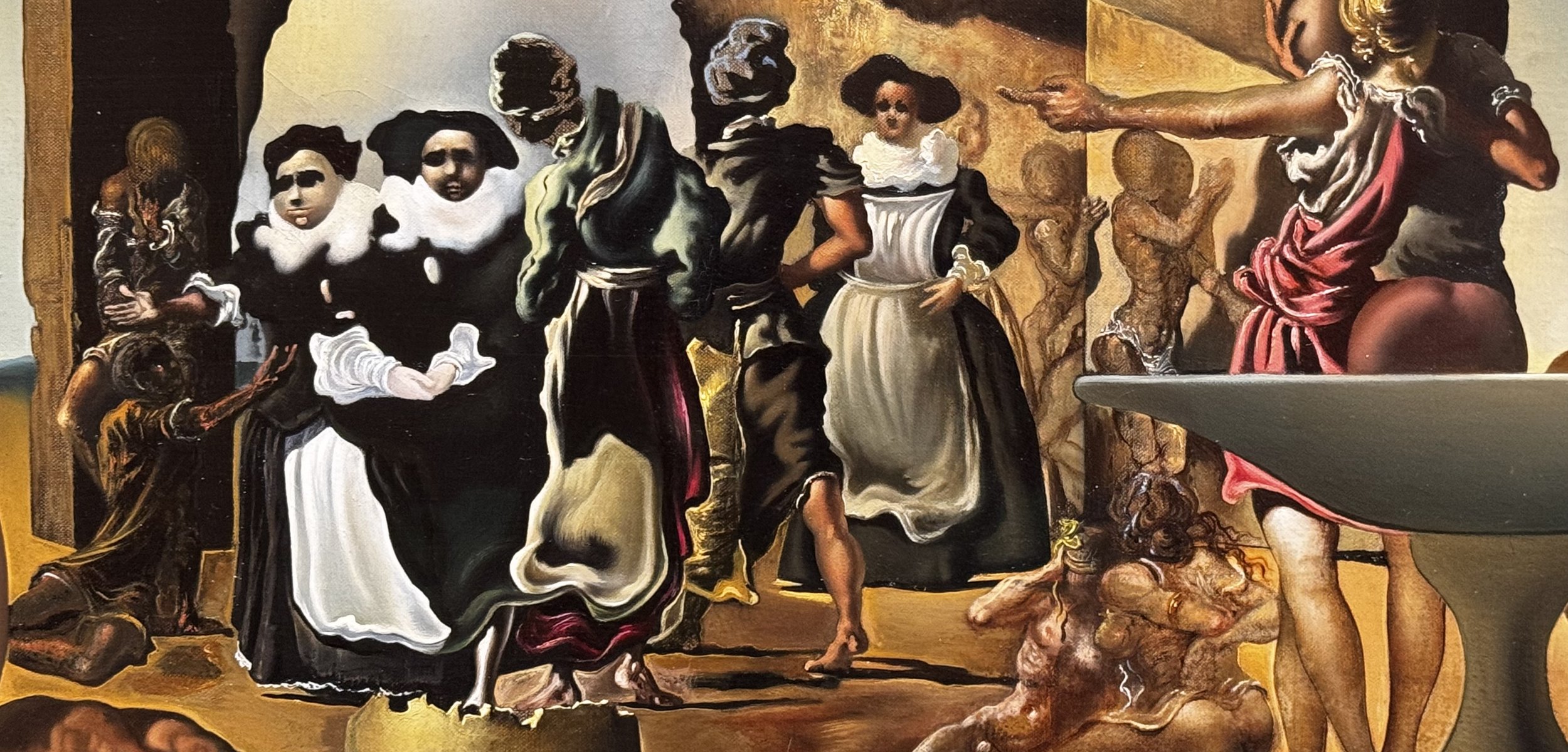
In this crop you might only see a row of people.
The answer is 21. If you only counted 20 then try stepping back from your screen and squinting. Do you see it now? Two nuns wearing black and white robes stand in front of an arched entry, but if you adjust your eyes just right you will see what appears to be a bust of French writer and philosopher Voltaire (1694–1778). Don’t worry, I also wouldn’t have known who it was were it not for the title and the wall text, which explains “The subject is 18th century French philosopher Voltaire, whose philosophy of commonsense rational thought clashed with the surrealists' irrational worldview. Dalí expressed his aversion visually by associating Voltaire's rationalism with "slavery".”
That’s a lot to unpack, and one has to wonder if Dalí ever got annoyed that most of the writing about this painting focuses solely on how and why the illusion works. Many, many, many articles have been written (those are just three) with extensive analysis on how the brain interprets a double-image and manages to switch focus, but all I want to know is how Dalí figured out how to create it all the way back in 1940. The further we progress into the era of computer generated imagery, the more impressed I become with what artists were able to accomplish in an era in which black & white television was the most cutting edge visual technology.
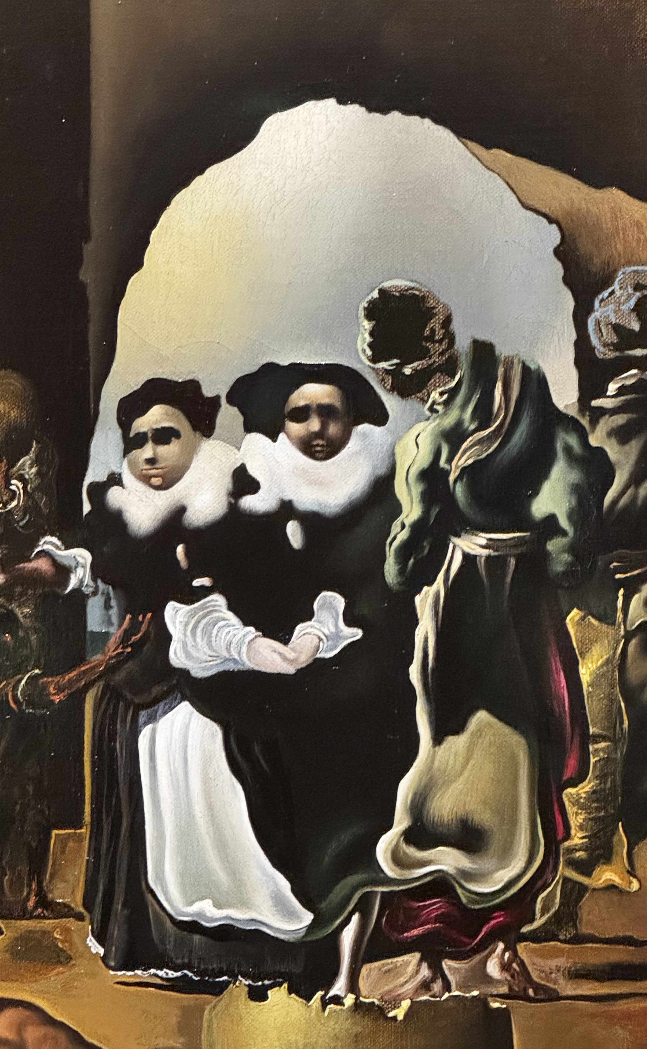
If you don’t see Voltaire… squint!
Did he paint the face first, and then manipulate and augment the features until they became the two nuns? I found a website in which a photo of an actual bust of Voltaire had been superimposed over the canvas, scaled to match the painting. Dalí was known to have employed photomontage in his practice. It’s possible he used a photo as an underlay upon which he painted the rest, but now I’m just dancing in the land of conjecture because I can’t find any resources online that definitively answer my question. I do know, however, that Dalí must have been quite pleased with the result and clearly relished another opportunity to make his political statement against Voltaire because one year later he painted a variation that looks like a tightly cropped version of the original, except with more elaborate figures.
Going back to the masterwork, the effect is so good, almost perfect, that most viewers never notice anything else on the canvas even though the bust only occupies ~10% of the scene. It’s such a powerful effect that like a magician’s misdirection technique to ensure you’re not seeing how the trick is achieved you end up almost completely ignoring the multiple stories taking place within the other 90% of the frame. And because it’s Dalí, there are indeed many weird things to discover once you manage to take your eyes off Voltaire. Scroll back up and have a look.
That’s why I like it.
Never pass up a BOGOF!
Previously, on Why I Like It:
Jun — Millennium Bridge Chewing Gum Art (2013-present), Ben Wilson
May — Asparagus Duo (2023, 2025), Joel Ely / Russell Webb
Apr — Art on the Underground (2000-present), various artists
Want more? Here’s a list of the first three dozen articles in this series.